First: “Outlander-Part II” is almost finished, but, in the meantime, here is a little eye candy for your pleasure!
Remember this beautiful house in Houston that was featured on the cover of Veranda many, many years ago? At the time, this was one of the first “Houston Look” houses that was featured in a national magazine. It inspired a look that is still emulated today.
The house was designed by Babs Watkins, and this, along with another house she designed on South Boulevard that was also published, helped secure her place as an important interior designer.
Besides her design work, Watkins opened an antique store on Bissonnet which featured a new aesthetic – a continental mix of French, Italian and Swedish antiques, many of which sported painted finishes. The look was similar to that found in New Orleans, but it had its own vibe. The shop’s walls were fauxed by Jay Iarrusi in a most gorgeous way which no one had really seen before.
Babs wasn’t the only Houston designer who changed the look of Houston houses – but the others all shopped at her store: when a new shipment was unloaded, designers would vie to be first to see the goods.
While well know in Houston, this 1999 Veranda pictorial helped spread the word of Watkin’s talent past the borders of our town. And, for good reason.
The house in Veranda: It was feminine. The furniture was mostly antique, French. The walls by Iarussi were made to look old in a subtle way. It was sparse. The cluttered English look that so many Houstonians favored was the complete opposite to this highly edited design. It was, in a word, ethereal.
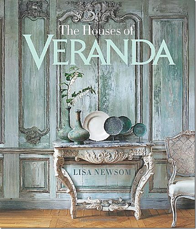
Thirteen years after the Verada cover, the house was featured in the book “Houses Of Veranda” which is a real testament to its importance.
It was renovated by Patton W. Brooks, the landscape design was by Sarah Lake, the photographs were taken Peter Vitale, and the lovely, late Chris King styled the Veranda story – what an A-list of professionals.
If you are a fan of the house, you may be excited to see new photographs of it – taken from HAR. The house is now for sale HERE.
Enjoy!
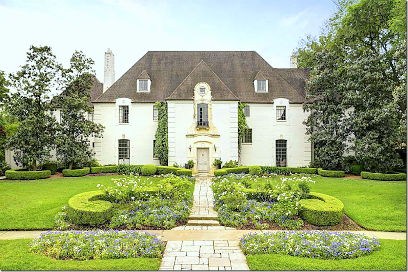
The house is just as beautiful today as it was when we last saw it in 1999. The landscaping is more mature now. Loving the shape of the curved, clipped box.
The house was custom designed in 1937 by Houston architect Joseph Finger.
The property is large – it sits on over one acre. To the left you can see a wing that was added on by the current owners.
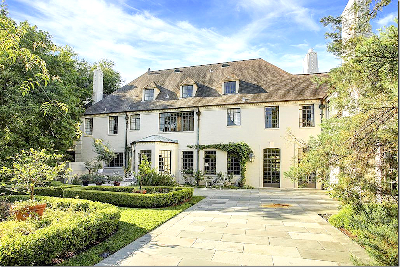
The back view shows the new wing on the right where the family room is.
The breakfast room is in bump out. The living room is at the two French doors on the right. The dining room is between the two.
A private brick garden outside the family room.
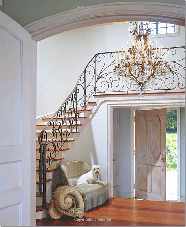
1999: The two story entry hall shows the original Finger designed romantic railing. Walnut wood floors, and a charming antique settee, typical of Babs Watkins aesthetic.
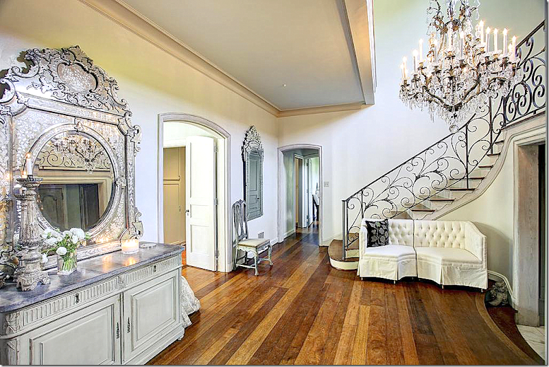
Today: a much bigger view of the foyer. Beautiful Venetian mirrors and painted buffet. The entry leads straight into the dining room with its views of the large back terrace and landscaped yard. Notice there is a new settee.
You will see that most of all the furniture remains – but many pieces are in different places than the magazine shoot.
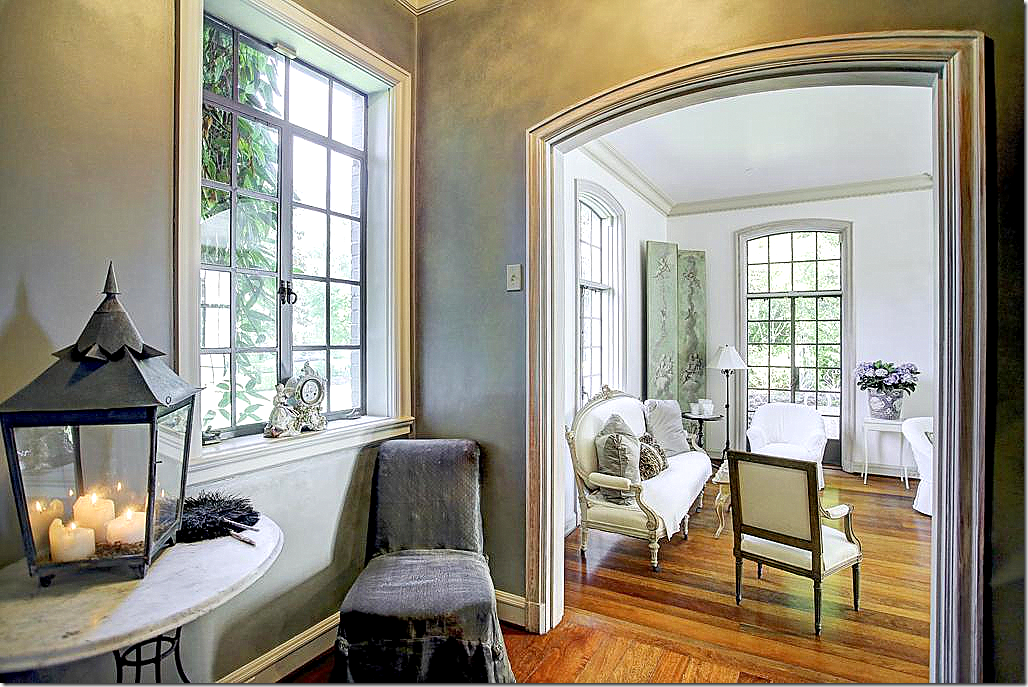
Off the foyer to the left is this hallway that leads to the living room.
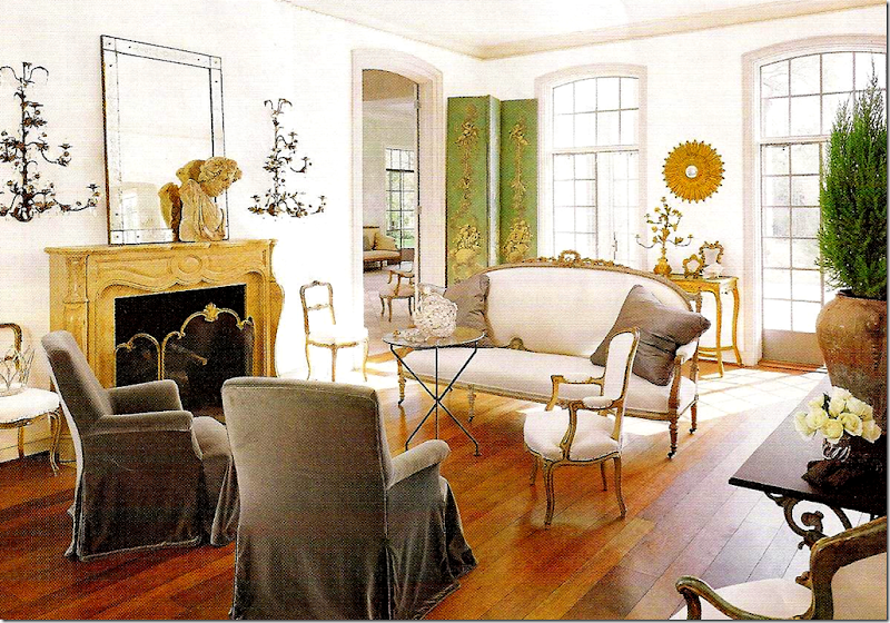
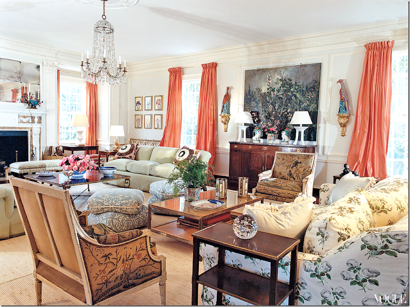
1999: The living room as shown in the magazine. So beautiful! For years, this has been such a loved room. This picture has been pinned so many times. Was this the first time since the 60s that we saw an antique gold sunburst mirror?
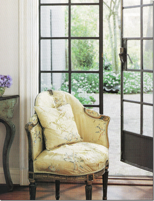
1999: Leading from the living room to the back terrace. All the metal windows and doors are original and have been completely restored.
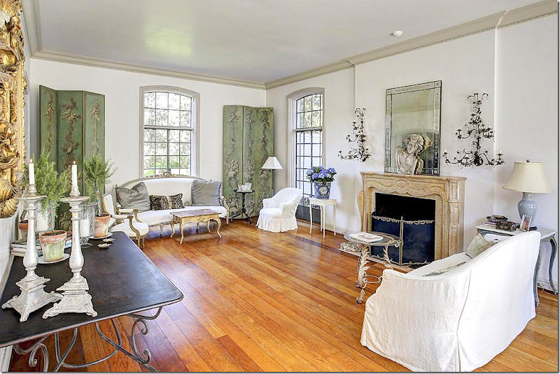
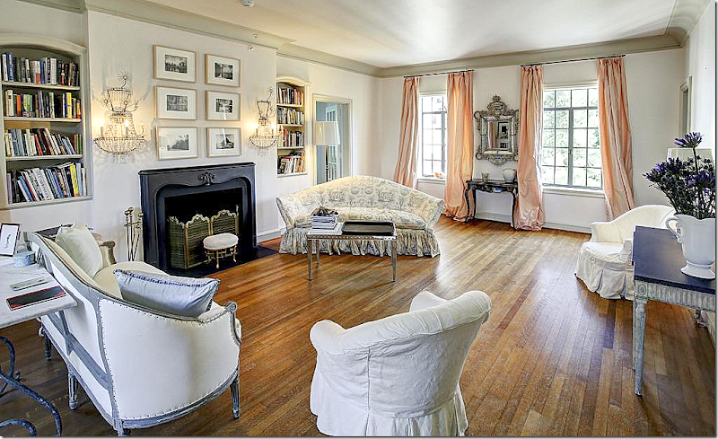
Today: The living room is the same – just the furniture has been rearranged. The settee and beautiful aqua screens are now at the front of the room as opposed as to the back.
Looking toward the back of the room. The aesthetic is sparse and clean – a heavily edited look. Babs didn’t do many curtains and this room really does call for clean windows.
At the back door – a beautiful painted table and Swedish chair.
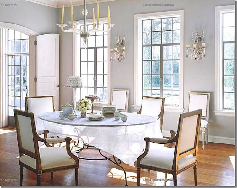
1999: The dining room. The sheer table cloth just furthers the ethereal look. So pretty!!!
1999: And against the back wall – such a wonderful French buffet.
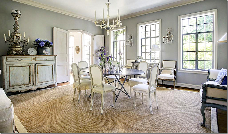
Today: the room has changed just a bit – with the addition of a seagrass rug. To the right, the Italian settee from the family room was moved here. And the chairs are different. It remains such a pretty room and it’s such a nice size too!
Between the kitchen and dining room is this butler pantry.
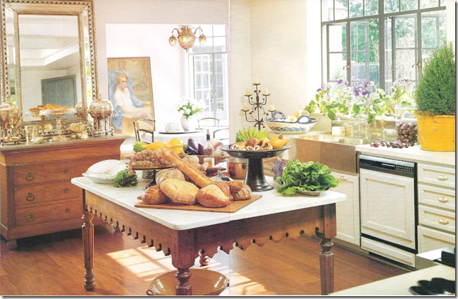
1999: The kitchen with its over the top styling that was so popular back then. You can see into the breakfast room with its large oil painting that is now in the kitchen.
Today: The kitchen looks almost exactly the same. The only difference is the oil painting is now here, which I love. Interesting how cutting edge the kitchen was – no upper cabinets. I remember Pamela Pierce did this first in her own townhouse.
The view to the other side. Past the kitchen is a sun room and then a study.
1999: The only view into the breakfast room. Looks like there is a wall of cabinets. This is probably such a pretty room with those large windows and doors.
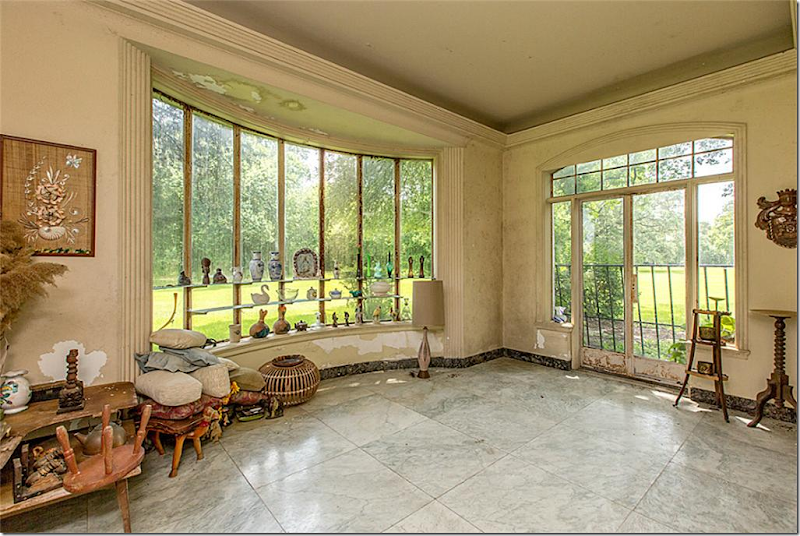
Today: The sun room with books and chairs. The stone floor matches that found in the new wing.
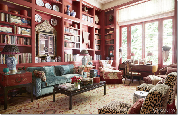
The study off the sunroom. These two rooms were a surprise. They were not featured in the magazine. Notice the inside wood shutters. And the Swedish chandelier (?) is so beautiful. I love the swag of hanging crystals.
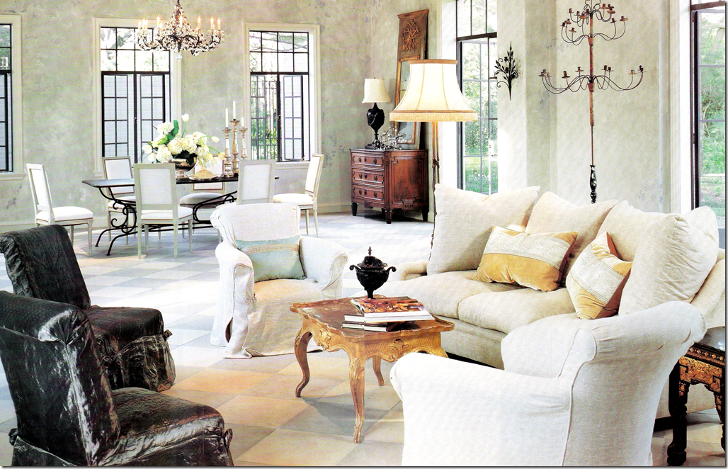
1999: Off the living room is the large family room in the new extension. The windows and doors were made to exactly match the rest of the house. The floor is a checked stone.
1999: The Italian settee that’s seen in the dining room now.
1999: a vignette from Veranda. Love the candelabra.
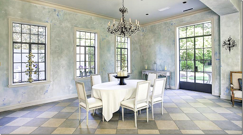
TODAY: A dining space in the family room. It looks like the extension was added on from this space.
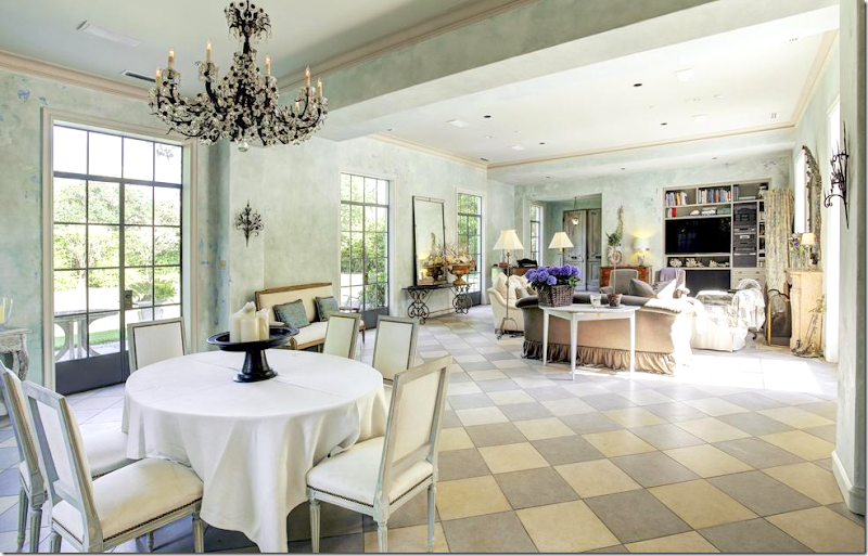
Look out towards the family room. This space is the most changed. It’s more furnished now than it was in Veranda.
Looking towards the back terrace.
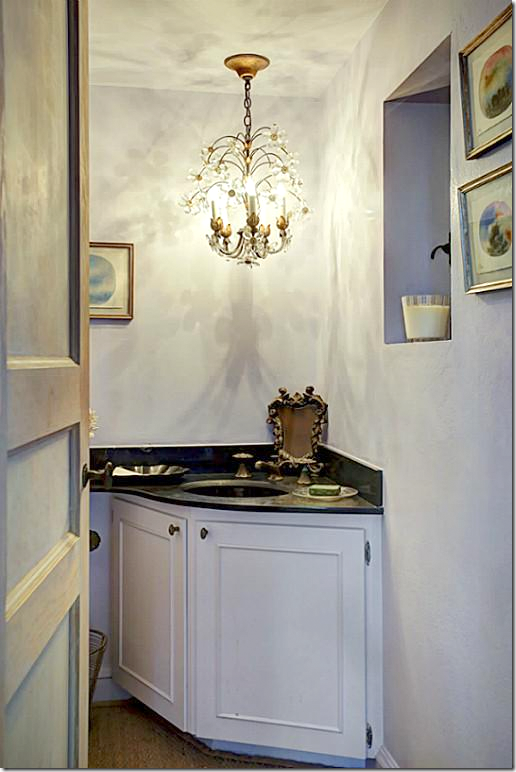
A bath room. Love the sink vanity.
And another bathroom.
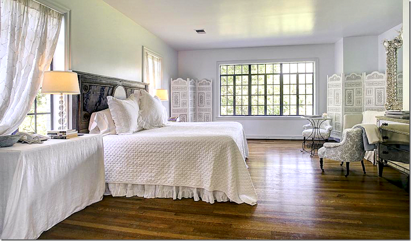
Upstairs there is a large sitting room off the master. Those sconces! Love!
The master with large window.
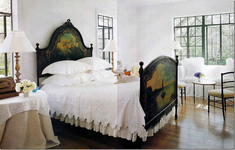
1999: The only bedroom shown in Veranda. This furniture was moved from the master to another bedroom below.
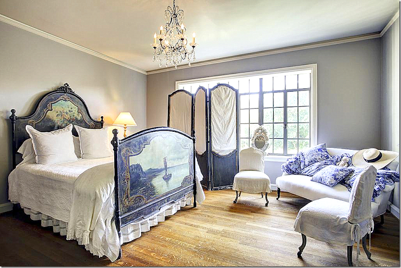
The same bed, but in a different bedroom. Love that headboard.
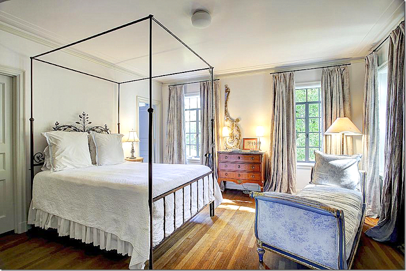
A pretty bedroom with silk curtains and an antique chaise.
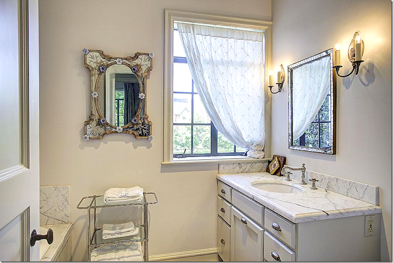
A bathroom upstairs with white marble.
The house is for sale HERE. Five bedrooms. Four 1/2 bathrooms. 8115 sq. ft. I am so curious to see what the new owners will do with the house. They will probably be a younger couple with lots of children. They might be more into the Hollywood Glam/Bright Colors – and I can see this house done that way too. But, I will miss the feminine look, the pretty furniture and finishes, the ethereal look that Babs Watkins created in each room!
The architect of the house, Joseph Finger, was a very prolific, very important architect, who helped shape the way Houston looked from the 1920s until his death in 1953. He was born in Austria in 1887 and moved to the United States in 1905.
Finger designed so many important buildings during his time. He was most well known for the Art Deco style, but as you can see from the Babs Watkins house above, he certainly could design any style. I have chosen a few of his more well known buildings to show:
Houston’s City Hall, 1939
Houston Municipal Airport, 1939
Lancaster Hotel, formerly Auditorium Hotel, 1926
The Lawndale Art Center, originally Barker Brothers Studio – a building which Finger himself owned. 1931, Main Street
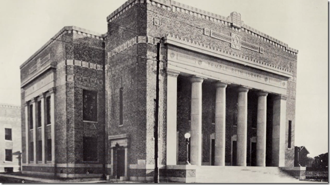
He designed Temple Beth Israel that today is the Heinen Theatre.
He also designed the mausoleum at the historic Beth Israel cemetery where Finger is now buried.
The Houston Turn-Verein Clubhouse, 1929 (demolished) – the precursor of the bowling alley craze in the US. This building, though demolished, is on the National Register of Historic Places (only in Houston - where we tear down the few historic buildings that we have!)
Beth Yeshurun, 1949 – now Lockhart Elementary. This is where I attended religious services and school when I was a child. The members couldn’t afford to build both a temple and a school, so they choose to build the school. A decade or so later, a new temple was built in another part of town. This building was then purchased by HISD and turned into a public elementary school.
Joseph Finger also designed the Plaza Hotel, Jefferson Davis Hospital, Ben Milam Hotel (the first with air conditioner.) He designed stores for Battelsteins, Levy’s, Everitt-Buelow, and others.
While he did design residencies, it appears most were done for friends or people for whom he also designed buildings.
The Minchen House, designed by Finger in 1931, is listed on the National Register of Historic Places and is a City Protected Landmark.
This house on North Braeswood was at the time the largest in Old Braeswood. 1933.
The house can barely be seen from the street, but you do see the gate – with two white concrete pillars. He designed this type of gate for several houses.
He designed the Citizens State Bank which later was repurposed as the nightclub Rockefellers on Washington.
Most interesting is the owners of Citizens Bank, Wade and Mamie Irvin, asked Finger to design a summer home on Morgan’s Point in La Porte, Texas, where many socialites then summered. The Irvin house was built right down the street from the landmark Governor Ross Sterling’s mansion.
Built on Clear Lake in 1927, the Irvin house is a Spanish Colonial Revival. It looks like the front garage was a later addition. I really doubt that Finger designed that.
I googled mapped this house and directly across from it is this house, which looks like it was probably once the garage/apartment to the Irvin house.
Surrounding the property is the white concrete pillars that are on several of Finger’s residences. The Irvin house is a Texas Historical landmark – you can see the plaque outside the gate.
The largest house Finger designed was this 17,000 sq. ft. Italian Renaissance Revival built for oilman Jim West in 1930. The mansion took three years to build and cost $250,000.
The front lobby and stair hall with double stairs and beautiful iron work.
The main drawing room off the stair hall. This house has a long history. After the death of Jim West, there were several owners and many years when the house was empty and neglected. It was terribly decayed when famous Houston basketball star Hakeem Olajuwon bought the estate a few years ago. He totally restored it and turned it into a store/showroom for his clothing line.
The same drawing room now showcases Olajuwon’s clothing line.
Olajuwon even changed the color of the roof tiles to Rocket/U of H red in honor of his b-ball days.
This Finger designed, 1936 Georgian classic house on South Boulevard just sold – after it was extensively renovated by Eubanks Group Architects.
Which brings us back to the Babs Watkins house in River Oaks. River Oaks is a very exclusive neighborhood built around a country club on Buffalo Bayou. Back in its early days, Jewish people were not allowed to live there – or maybe they just weren’t welcome. Regardless of which, many prominent and wealthy Jewish families built homes off Braes Bayou in a new neighborhood called Riverside Terrace – or the Jewish River Oaks - as it was quietly known.
Many families with well known names such as Sakowitz, Leon, Turboff, Meyer, Battelstein, and the Bordens, among others lived there. At that time, if you were Jewish and didn’t live in Riverside Terrace, you lived very close to it.
It all changed in 1952, when a wealthy black cattleman named Jack Caesar moved in. A bomb was detonated on his front porch, but he stayed. Once that happened, more and more black families moved into the neighborhood and many white families moved further south to new neighborhoods like Meyerland.
News clipping from that event.
Some whites saw the opportunity for an integrated neighborhood and refused to move; they would put signs on their yards announcing they were staying in Riverside Terrace.
The story of this neighborhood was told in an award winning documentary called "This Is Our Home It Is Not For Sale." To read more about this film and to order it, go HERE.
I grew up in this era and had a friend whose family refused to move out of Riverside Terrace. She grew up in this fabulous custom designed house – with a tree in the foyer’s open air atrium! The neighborhood was filled with custom houses, both classic and modern. Most of Houston’s well known architects of the time designed houses for Riverside Terrace.
Today, this neighborhood, with its wonderful vintage houses and its close proximity to the Texas Medical Center, is very much integrated.
Joseph Finger built this house in Riverside Terrace for Abe Battelstein. He also designed the downtown store for Battelsteins.
Battelsteins was one of the more popular department stores in Houston.
Right across the street from the Battelstein house was this Joseph Finger custom designed house for Abe Weingarten. The Weingartens were a large Jewish family in the grocery business. In later years, they became active in real estate.
Finger was good friends with the Weingarten family. He designed many of their early grocery stores, above, with an Art Deco look.
One of the most fabulous houses in Riverside Terrace was custom built in 1935 for another Weingarten – Joe.
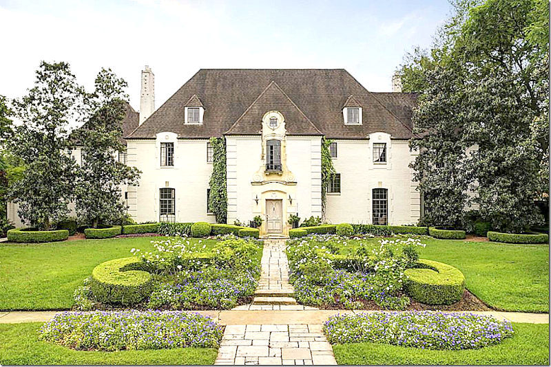
The house Finger designed was a white, French style chateau that looks remarkably like the Babs Watkins house in River Oaks. That River Oaks house was also custom built for the prominent J. A. Platt family in 1937. Looking at these two houses – one wonders if the River Oaks family had seen the Weingarten house and ordered one just like it?
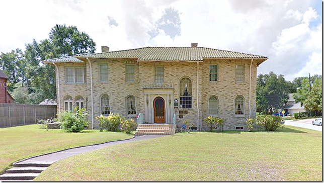
Here is the Finger designed house in River Oaks that is currently for sale.
Looks a bit similar. Or, it looks like what the River Oaks house might have looked like if it hadn’t been cared for in over 40 years?
This 1935 French-style chateau in the historic Riverside Terrace neighborhood was recently listed for sale for $2.25 million plus an additional lot could be included.
The original owner, Joe Weingarten, had sold the house in 1967 and the family that bought it had let it decline. Nothing was done to it in all these years. No painting or vacuuming, no dusting. Nothing. The house is a time warp.
When Finger designed the house – it was the largest one in the neighborhood and was the gem of Riverside Terrace. All the fixtures and the wood floors are original and intact. Developers have been eyeing the property for years, but the current owners refused to sell until their patriarch passed away. Preservationists were afraid developers would tear it down and divide the land into separate lots.
None of that is going to happen now since it was sold to a couple who plan to fully restore it to its former glory.
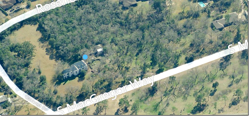
Here’s an aerial view of the large property. The house is 4 bedrooms, 5,480 sq. feet. on over 4 acres.
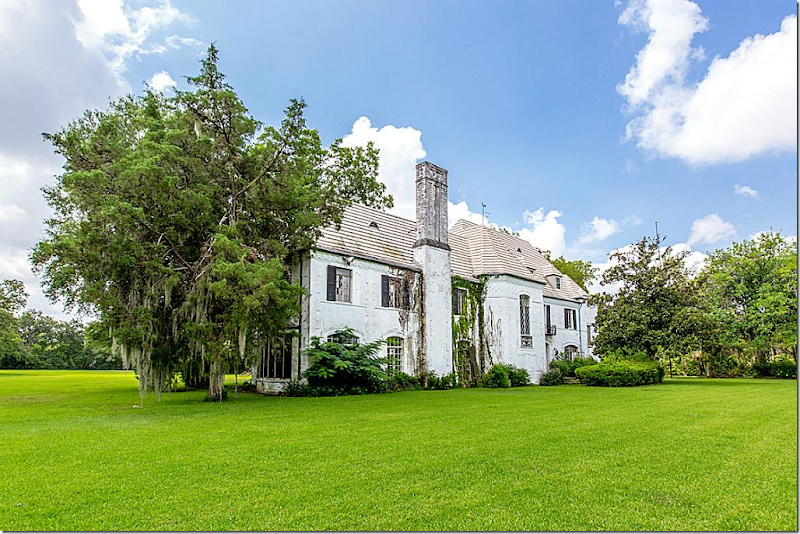
The front, again.
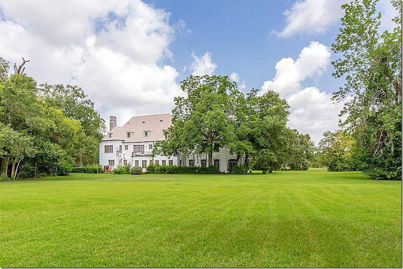
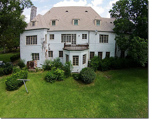
The back.
The back. Notice the bump out? Look familiar? In the River Oaks house, the breakfast room is in such a room. The difference is that here there is a French door on the second floor that leads out to the roof of the bump out.
Here is the back of the River Oaks house for sale.
Get read for the decay!!!
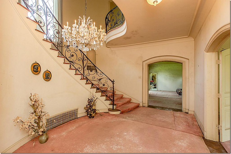
Pink carpet covers the hardwoods. And it is disgusting. But look at that railing. And the curved landing above. There is so much potential. I can’t wait to see what is done to this house!
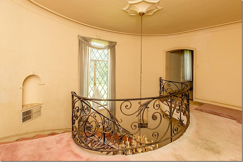
The landing.
Now, compare it to the River Oaks house. This shows you the potential. The railings in both houses do look very much the same.
Yuck! I know! But – this living room will be so beautiful when restored. The room has such beautiful proportions.
Wouldn’t it be pretty decorated like Tory Burch’s living room? These two rooms remind me of each other.
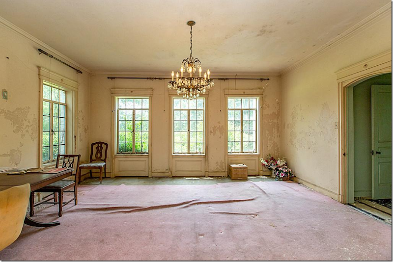
Beautiful arched woodwork leads to the what I think is the dining room.
Not sure, but it could be the dining room. It would be lovely with the fireplace and the windows on both sides of the room.
This would be a pretty way to decorate the dining room.
The study. Call Segreto! ASAP!
This would be a great way to paint the paneling.
This sunroom reminds me so much of the River Oaks house.
Tory’s sunroom décor would be pretty here.
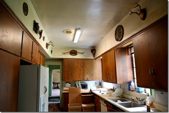
The new owners said renovating the kitchen was an issue – it is very small.
The bedroom. Lord.
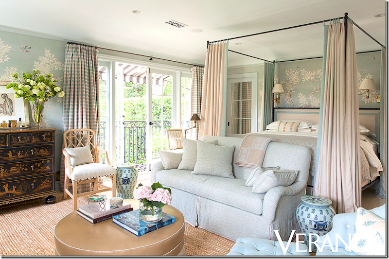
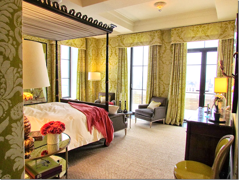
How about this bedroom – Mark Sikes own house? The canopy would be best to make the room more cozy.
Or a little more dramatic.
In the end, it’s amazing to compare the two houses. One cared for and one neglected. It shows how quickly a house goes to waste. Just 40 years and the Weingarten house was completely destroyed! And I loved seeing how this architect, Joseph Finger, who so clearly loved Art Deco, designed these two houses – both French Chateaus - and how beautiful they both are!
Just beautiful!!!!
Whew. OK – I thought this was going to be a short little story about a house for sale that had been in Veranda! Instead it became something else.
I hope you enjoyed the twists and turns!
To see the River Oaks house, go HERE.
To read about the Weingarten house, go HERE and HERE for more pictures.
Hopefully the new owners will publish the house when the renovations are finished so we can see the befores and the afters.
To learn more about Joseph Finger, go HERE.
The shop Watkins Culver is now available to everyone – it’s online at 1st Dibs HERE.
Next up -- Part Two Outlander.
































Tidak ada komentar:
Posting Komentar